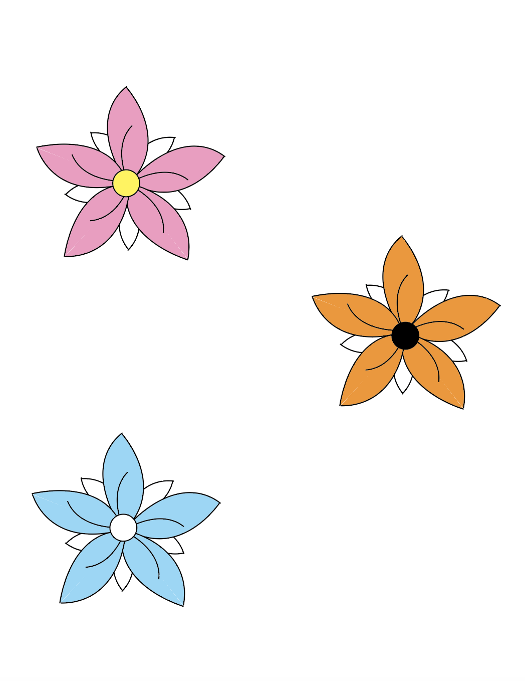
For my logo project I decided to do a flower because I feel like they most represent me. I have many pieces of jewelry with flowers on them and I also always keep flowers in my house. I just like how they look and smell. For the final project I decided to go with specific colors. For the first flower I did white, pink, and yellow. White meaning fresh and simplistic. Pink meaning happiness, compassion, and hope. Yellow meaning vibrant, happiness, and sunshine. For the second flower I chose the colors white, orange, and black. White meaning fresh and simplistic. Orange meaning excitement and confidence. Black meaning classic and elegance. For the third flower I chose the colors white and blue. White meaning fresh and simplistic. Blue meaning loyalty and trust. I believe that all of those terms describe me, so I wanted to include them in my logo. I originally just had the idea for a flower and then I wanted to do a hydrangea because that is my favorite flower. The hydrangea did not work out because it was to busy for a logo so I just stuck with a simple flower. Below I will have my sketch and my black and white version of my ideas. I also will attach a picture of the color meanings.
Original Sketch:


Color meaning:

My favorite is definitely the pink one, such a cute yet simple design
ReplyDeleteThats my favorite too:) Thanks!
DeleteI think the flower was definitely the right choice out of all the logo ideas you came up with.
ReplyDeleteThanks!
Delete